Simplify the
User Experience
Meg Swayze | UX Researcher | UX/UI Designer
Responsive Web Redesign for
Education
I chose a real world case study instead of a hypothetical because I was curious to see the differences between theory and practice.
Having agency and bandwidth were two differences that stood out to me. Creating user friendly digital experiences includes access to financial resources, manpower, time, and UX education.
Motivating and empowering the stakeholders, resourcefulness, ongoing communication, and creating simple minimal viable products worked to alleviate barriers.
How Might We ?
Create a user-friendly digital tool that:
is an intuitive, clear, and beautiful resource for the user,
makes relevant information accessible for prospective families,
makes relevant information accessible for current families,
is a true extension of the school’s value proposition, and
is easy to keep updated by leadership at LLS.
PROJECT TIMELINE
January 2023 - Present
MY ROLE
UX Researcher, UX/UI Designer
THE CLIENT
Lexington Latin School is a JrK - 12th private school.
VALUE PROPOSITION
Hybrid Christian classical traditional school. In person 3 days a week and at home with
assignments provided for other 2 days. High family focus.
THE BIG PICTURE
Create a system that is easy to maintain and is intuitive, clear, and beautifully simple.
SKILLS
Figma, Adobe XD, Procreate, Information architecture, User interviews, Landscape research, Competitor analysis, Usability testing, Wire framing, Prototyping, Design system, Responsive design, Iteration
Design Thinking
Many excellent design guides exist. However, I utilized Nielsen Norman’s guide because of the circular format over linear. The circle reminds the UX/UI designer not to be afraid to iterate when needed.
-
Look, Listen, Learn, Ask Questions!
-
What patterns emerge?
-
What if? Think big and Refine.
-
Make Tangible for Critiquing.
-
“What works?” Evaluate and Iterate.
-
Deliver.
During the Empathy stage of the UX design process, research is conducted to gain a deep understanding of the users and their needs. This research helps designers to empathize with the users' perspectives, uncover insights, and identify pain points, allowing for the creation of user-centric solutions that truly address the users' challenges and aspirations.
Empathy
I was Curious.
Could I develop a simplified website that met the users needs and empowered the leadership to be able lead the digital experience?
PRIMARY RESEARCH
Analyze the current LLS Website.
Identify who are the users?
Meet with leadership to understand their understanding of the website.
Meet with faculty to understand their concerns about website.
Conduct initial usability studies with families to understand the users.
USER GROUPS
Prospective
Families
Current
Families
Leadership &
Faculty
PAINT POINTS
Inaccurate Information
Some information was not updated
(like academic calendar).
Missing Information
Some information was missing
(like teacher bios and photos).
Broken
Links
Some links were not working.
(like Apply Now).
Too Much
Content
Reduce content to what is necessary
and reflects value proposition.
What I Learned.
Power of communication and reflection. Fully understand the value proposition and be sure all photos and content reflect this proposition. Simplify the website to what is essential. Be sure photos represent the lower and upper school and are up to date. Be sure all information is accurate and clear. Clearly defined what is a classical, Christian, traditional school. Add third party links and check the links for UX. Create a system that is able to be updated by leadership.
SECONDARY RESEARCH
To inform the design thinking by identifying strengths, weaknesses, and opportunities for improvement through comparative analysis.
Competitor Anaylsis
DIRECT
Veritas Christian Academy
Energetic, social vibe
Red is dominant web color
STRENGTHS:
Clearly organized and simplified curriculum overview
Push to required preview day
Donate CTA
Accreditation on home page
Interesting titles for quick links
Required reading
WEAKNESSES:
“Scholar Connect” CTA purpose unclear
About and School Life menu could be better utilized
8 tasks to complete to apply looks daunting
No photos of faculty or leadership
Trinity Christian
Academy
Lot’s of purple vibe.
Purple is dominant web color
STRENGTHS:
Strong prospective parent drive for home page (academic strength and growth of school)
Giving menu item
Specific designed athletics page
WEAKNESSES:
Narrow header with too many menu items and drop downs
No clear designation of who TCA is on home page
About and Academics wordy and missed potential
New menu items on athletics with no back button
Long quick links
Shopping cart
INDIRECT
Veritas
School
Active school life vibe.
Navy and gold dominant colors
STRENGTHS:
Clear Mission and value proposition “Distinctive”
Focused word choice, photos, and quotes
Color choice and font consistent
Nice overlay of information over photos
Clean and easy to read and navigate
Separate log in is clear
Menu bar is full but have moved the logo up
About provides a true sense of school culture
Nice hover from outline to gold
Giving option
WEAKNESSES:
Too many menu, sub menus, and even more menus plus more menu items in footer
Lots and lots of information to curate
No home page menu item
Highlands
Latin School
Direct, neutral, orderly mood
Navy and gold dominant colors
STRENGTHS:
Clear Mission
Intentional founder quotes
Informative Blog
Clear information called “At A Glance”
Accredited information and associations clear
Clear tuition and fees with days and start times
Helpful but wordy overview of curriculum
WEAKNESSES:
No value proposition
Navigation gets stuck on cottage school
Classical, Christian, Traditional below the fold
No address information in header
Header too many menu items
Too many drop down items
What I Learned.
Colors influence the mood of the page. Options to donate on 3 of the 4 sites. Student portal log in on 3 of the 4 sites. Navigation too complicated on 4 of the 4 sites. Good site navigation gives us confidence in the organization. Be sure each new page has clear page title that matches the menu item. The home page is essential to cast the vision for the site. It needs to clearly identify what type of school? what ages does this school include? what is the academics, sports, and school life? why this school is where I need to be? Veritas school in Virginia is the only of the 4 sites to have a tagline- “A Place to Flourish.” It also addresses the four questions for the home page.
Define
During the Define stage of the UX design process, personas are created to provide a human-centered framework for understanding and empathizing with the target users. These detailed fictional characters represent the key user groups and help designers gain insights into users' needs, goals, behaviors, and motivations, ensuring that the subsequent design decisions are rooted in a deep understanding of the end-users.
User Persona
Meet Maggie.
“I want to homeschool my children but I am overwhelmed by the prospect of doing it all by myself. I want a hybrid.
Age
Education
Family
Occupation
33
College
Married, children (3, 5,7)
Baker
Maggie is a baker. Her husband has his own business. They are very busy but education and family time are very important. As their children are entering school, they are looking for an environment that has more flexibility so that they can have more family time. They are also interested in homeschooling to preserve in their education what they value. But homeschooling alone seems daunting.
Goals
Spend more time with family.
Ensure children have a solid education.
Share community values with family.
Frustrations
““Is this a homeschool or private school?”
“Why are there two school locations? Where would my child be?”
“Why are there so many teacher photos missing on the website?”
What is a Classical, Christian, Traditional school?
Empathy Map
-
Says
“I want to learn more about LLS. Can you tell me more about the school?”
-
Thinks
It is Christian? Homeschool? Private?
What is a traditional education?
Why are there so many missing faculty photos?
Is this school right for our family?
-
Does
Clicks under different tabs and CTA buttons to see what is discoverable.
Might be done on a desktop, cell phone waiting in carpool line, tablet during nap time.
-
Feels
Confused by two campus locations.
Frustrated by many links are not current or active.
Overwhelmed because there is too much information.
Excited by the photos and the video.
PROBLEM
STATEMENT
Maggie is a baker and mother of young children who needs information about LLS to see if it matches her family’s needs because her free time is limited and she uses her breaks to take care of family tasks.
USER
STATEMENT
As a busy mother, I want to quickly access information on my cell phone so that can make informed decisions for my children’s education.
Usability Script
For a sample of the script. Select Here.
IF/THEN
STATEMENT
If Maggie is able to access the LLS information quickly and accurately, she will be happy she is informed and can make decisions for her family.
Journey Map
For a sample of Maggie’s Journey Map.
Select Here.
During the Ideate stage of the UX design process, the artistry of bringing it all together begins. With a solid understanding of the user needs, goals, and insights gained from research, designers can now unleash their creativity, pushing boundaries and generating a wide range of ideas that have the potential to result in unique and impactful user experiences.
Ideate
MAKE THE MOST IMPORTANT INFORMATION SEEKING TASKS EASILY ACCESSIBLE.
By considering accessibility early on, designers can proactively address potential barriers and constraints, resulting in more inclusive designs that provide equal access and a positive user experience for individuals with disabilities or specific needs.
Information Architecture
Notes to include why each component is important to the user and the design.
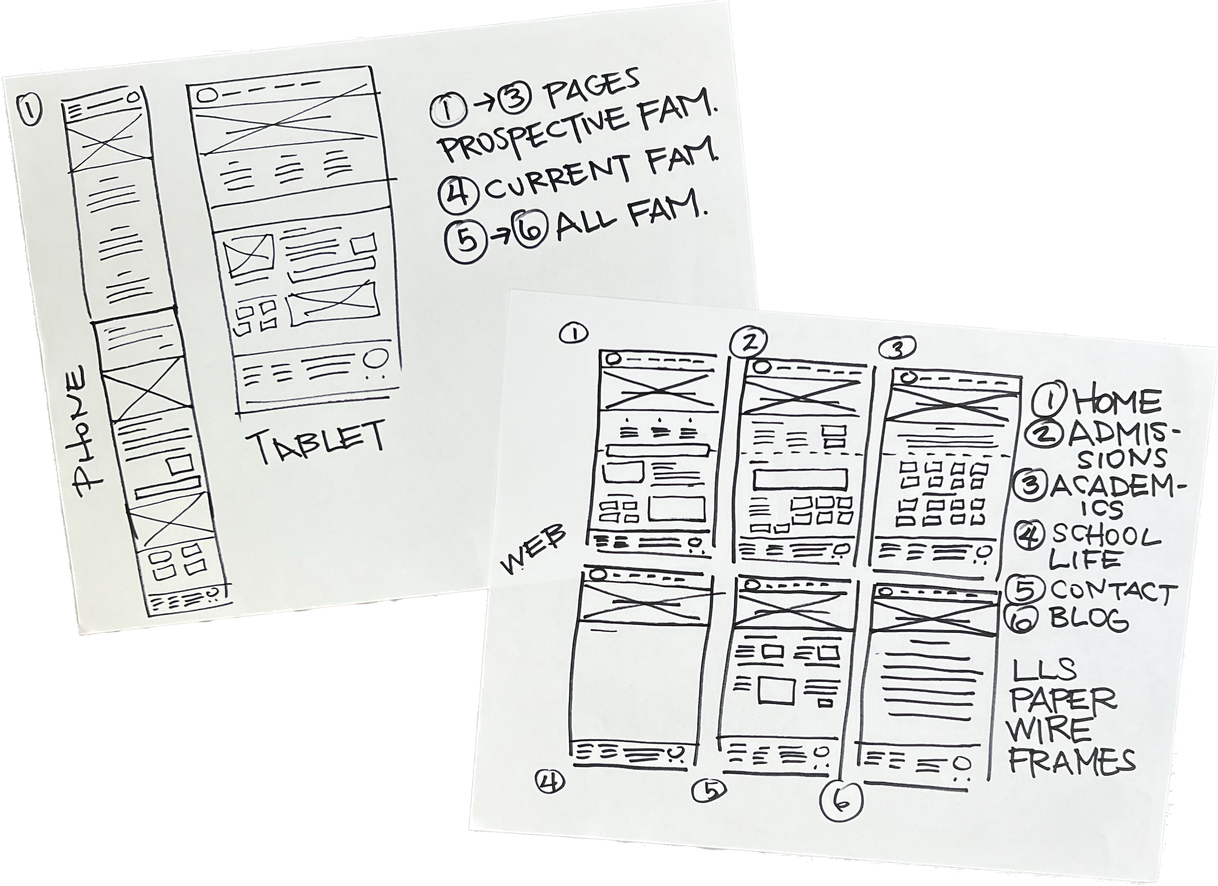
Sketches
As with any great artwork, sketches are essential, inexpensive, and time saving.
Begin with a drawing of the current app and make notes for improvements based on findings.
What I discovered on the journey
Through research, a need surfaced for a user friendly uniform style guide to help facilitate education and communication with families, leadership, and faculty. I created a style guide on procreate.
Watercolor sketches of School Uniform Guidelines.
Getting feedback during the prototype stage is essential to gather insights and identify usability issues early on. Involving users and stakeholders in the feedback process helps validate design decisions, uncover challenges, and make necessary improvements, ensuring the final product meets user expectations.
Prototype
ACCESSIBILITY
Colors selected are WCAG AA and AAA compliant. Proximity and Padding designed for accessibility. Headings used for ease of reading.
FONT GUIDE
Heading guide created. Paired fonts selected EB Garamond and Open Sans.
WHAT I LEARNED
Redesign is responsive. It is Mobile first The text and colors were chosen intentionally to relate to classical academia.
FONT SIZE FOR DESKTOP
MENU Titles Open Sans 20 Bold All UC
H1. Page Titles EB Garamond 56 Bold UC and LC
H2. Section Titles EB Garamond 36 Bold UC and LC
H3. Subtitles EB Garamond 36 Regular UC and LC
Paragraph Body Open Sans 20 Regular UC and LC
CTA Buttons Open Sans Regular UC and LC
Footer Title Open Sans 16 Regular UC and LC
Footer Subtitle Open Sans 14 Regular UC and LC
DESKTOP
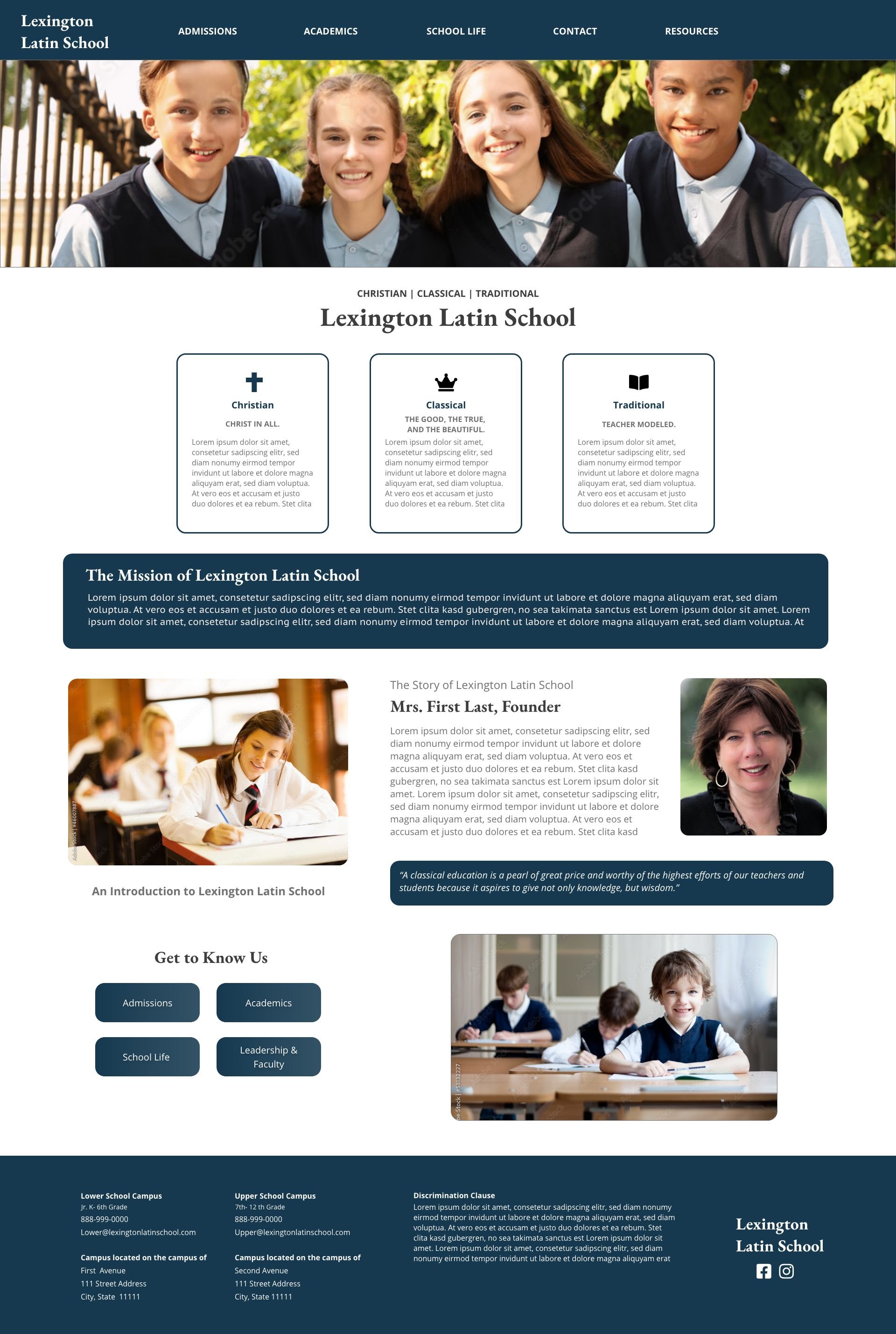
This project began a desktop design. For the full high fidelity prototype app Select Here.
RESPONSIVE CELL
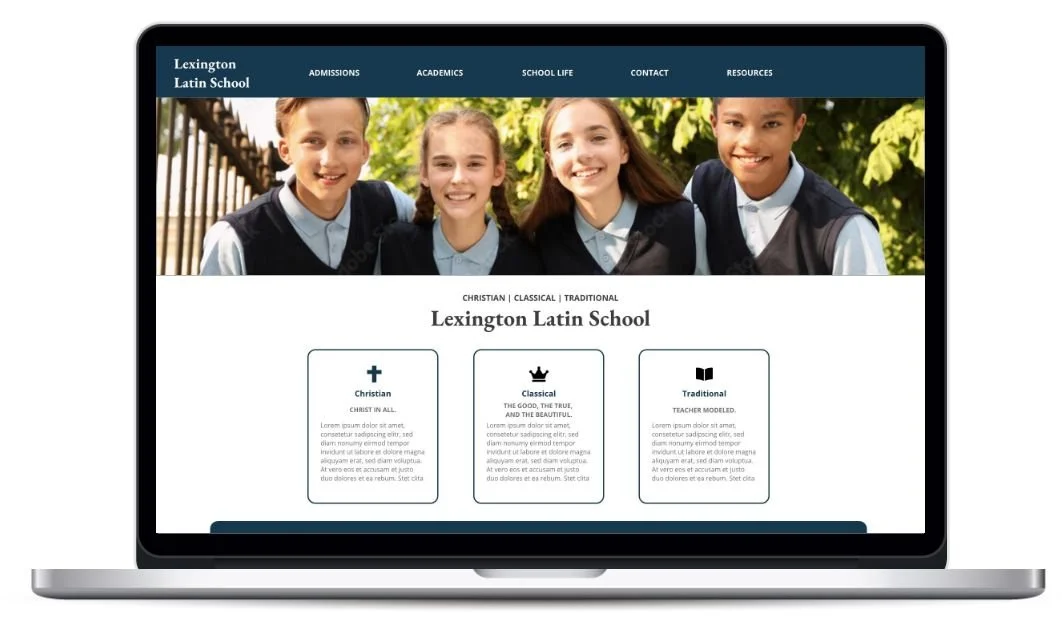
This project is responsive. For the mockup of the cell homepage Select Here.
TABLET
After cell design the tablet was designed. For the mockup of the tablet homepage Select Here.
Testing during the UX design phase is crucial as it enables designers to validate their assumptions, identify usability issues, and gather feedback directly from users. By conducting thorough testing, designers can ensure that the final product truly meets user needs and ultimately leads to higher user satisfaction and engagement.
Testing
USABILITY STUDY
Usability Studies conducted after low fidelity and high fidelity dedicated apps and high fidelity responsive cell phone design. To see the UX Research Plan Select Here.
KEY TAKE AWAY
This was the most difficult part as a student completing a project. It took the most time identifying, connecting, and completing the usability studies and having access to data.
Usability Studies Feedback
Based on feedback from low fidelity and high fidelity prototypes, changes were made. Below are the comments and changes.
Two Campus Information
Since the school meets at two separate locations, this needed to be clarified.
Tuition
Finances are very personal. Tuition needed to be clear and accessible to find.
Uniforms
The school needed to communicate the “why” of uniforms, how to purchase uniforms, and educate families on the dress code (e.g., the style guide).
Admissions Information
Add more information about the “the why” of who LLS is. I added a “Who We Are”
Diversity
Include photos of students in all grades so that prospective parents will know the school serves PreK-12th. Have students in the act of learning.
CTA Buttons
From the homepage, CTA buttons that reflect answers to questions prospective parents would have.
Reflecting during the implementation stage of UX design is crucial to assess design decisions, evaluate project success, and identify areas for improvement. It enables designers to learn, iterate, and enhance future design processes, leading to better user experiences.
This case study is now being developed and will be launching soon!
Implement
Reflections
-
What did I do?
Simplified, Streamlined identified information for user.
Designed for usability for client for the future.
Guided, empowered the client in UX mindset.
Designed responsively and for accessibility standards.
-
Why did I do it?
Based on the data from the usability studies and the feedback from leadership, I made changes to the design.
-
What did I learn?
Engage, Communicate, Educate, Persist.
Agility in Adobe XD. and Figma, Reinforced Growth Mindset.
Accessibility Standards- Everybody wins.
Importance of responsive design.
-
What was the result?
A simple but beautiful design that can be updated by the client, reflects the mission and vision of the school, and communicates intuitively with the user. A case study that is now being developed.
Hi! I am Meg.
My work is fueled by the passion to identify, cultivate, and unleash the untapped potential of individuals, empowering diverse leaders to make a positive impact on our world.
I achieve this by creating human-centered designs that foster meaningful connections, eliminate barriers, and pave the way for mutually beneficial outcomes.
In UX/UI Design, I am interested in areas related to Accessibility, Sustainability, and Generational Design.
If not creating, I am busy adventuring in the great outdoors with my family!


