
Reducing Food Waste
and Fostering Community.
Meg Swayze | UX Researcher | UX/UI Designer
Dedicated App and Responsive Web Design
for Social Good and Sustainability
According to Feeding America, each year 119 billion pounds of food is wasted in the United States.That equates to 130 billion meals and more than $408 billion in food thrown away each year.
More than 34 million people, including 9 million children experience food insecurity in the United States.
What if a solution existed to unite individuals with surplus food and those in need by bridging the gap between local home and community gardeners, as well as small-scale farmers with those seeking food or distributing food?

How Might We ?
Create a user-friendly digital tool that:
Connects those with surplus food to those in need,
Streamlines the sharing process,
Reduces food waste,
Fosters community,
Provides educational resources, and
Tracks impact on reducing food insecurity.
PROJECT TIMELINE
6 weeks, March- April 2023
THE CLIENT
Local non-profit organizations serving those with food insecurity. Seedleaf, Food Chain, and Glean KY.
MY ROLE
UX Researcher, UX/UI Designer
PERSONAL GROWTH
Navigating cold calls to connect with non-profit leaders presented a unique challenge. Overcoming initial barriers required a blend of tenacity and empathy. Forming impactful partnerships crucial to project success demanded not only Persistence, Passion, and Communication but also active listening and adaptability. This transformative journey not only refined professional skills but also cultivated resilience and interpersonal expertise, demonstrating that personal growth often thrives in the face of challenges.
TECHNICAL SKILLS
Adobe XD, Procreate, Information architecture, User interviews, Landscape research, Comparative analysis, Usability testing, Wireframing, Prototyping, Design system, Responsive design, Iteration

Design Thinking
Many excellent design guides exist. However, I utilized Nielsen Norman’s guide because of the circular format over linear. The circle reminds the UX/UI designer not to be afraid to iterate when needed.
-
Look, Listen, Learn, Ask Questions!
-
What patterns emerge?
-
What if? Think big and Refine.
-
Make Tangible for Critiquing.
-
“What works?” Evaluate and Iterate.
-
Deliver.
Let’s Get Started.
Select the area you want to explore.
This vital beginning is about gathering information. Qualitative and quantitative information is collected. This is my favorite part of the process. I enjoy being a story gatherer. Listening to stakeholders, users, studying data. Through active listening and being observant; you can begin to see the big picture and the individual components that are leading to pain points and passion points.
Empathy
PRIMARY RESEARCH
I began the process by identifying local leaders in food advocacy and conducting interviews with these organizations.
Through this research, I gained a deeper understanding of the target audiences-- their journeys, needs, pain points and context in which they would interact with a product or service.
Lastly, I synthesized the information and determined a valuable product that could benefit the target audiences. I circled back with the organizations for feedback on my ideas.
SECONDARY RESEARCH
During my secondary research, I focused on gaining a conceptual understanding of food insecurity in my community and in the USA.
This information reinforced my Primary Research.


Competitor Anaylsis
As far as I could find through research, this product offering does not exist. Through creative indirect competitors, I gleaned valuable insight that shared similar big picture processes. Google and Apple user reviews also studied.

YUKA
Clear, simple UI Design.
Strong educational component.
Clear brand identity and mission.
Garden color choices.
FLASHFOOD
Clear engaging
“food hero” component
in content and “
savings” in
user settings.

FREEBIE ALERTS
Informative cards that
included distances
to free product.
Ability to personalize their alerts.
No log in required.

TOO GOOD TO GO
Strong missional component.
Engaging “food hero” component in content
and “your impact” in
user settings.
Define
During the Define stage of the UX design process, personas are created to provide a human-centered framework for understanding and empathizing with the target users. These detailed fictional characters represent the key user groups and help designers gain insights into users' needs, goals, behaviors, and motivations, ensuring that the subsequent design decisions are rooted in a deep understanding of the end-users.
Share Good Food Two Audiences
How Might We create a tool that is easy to use and beneficial to both target groups?
Home & Community Gardeners and
Small Scale Farmers
Hungry Families,
Your Neighbors, and the Community
A LOOK AT PAIN POINTS DISCOVERED.
-
For the Producer- Ease of use since could be outside in garden, farm. Volunteers could be inputting.
For the Consumer- Ease of use because access would probably be in the home on a computer.
-
For the Producer- Add and save options to quickly update what is available.
For the Consumer- The ability to personalize the experience for food preference and notification.
-
For the Producer- The ability to utilize a neutral drop off location (e.g., Little Pantries).
For the Consumer- The ability to know how far the food was from current location. Taking into consideration accessible transportation to get food).
User Persona
Meet Laney.
“We can’t figure out a simple way to let our community know when we have produce to share.”

30
Bachelor of Social Work
Single
Garden Director
Age
Education
Family
Occupation
Laney works at a community program that has community gardens in food deserts. The program also has small farms. The program is heavy on education with the desire to create future growers. She is young, energetic, and very busy with the maintenance of multiple gardens and small farms and the oversight of the volunteers. She grew up on a farm and sees the relationship of person to soil as dynamic and healing.
Goals
Easy way to let her community know when produce is available.
Bring people together over good food.
Share the joy of gardening and being in nature.
Impacting future generations and our environment.
Frustrations
How can I connect my neighbors with produce?
Although we plant what the neighbors suggest, sometimes we have new produce- how can I share information about the produce/recipes?
I am so busy with garden maintenance and volunteer oversight. How can I have time to inform my community.
PROBLEM STATEMENT
Laney, a busy director of multiple gardens and small farms, needs a simple and accessible system to notify her community about surplus produce availability without adding to her workload.
Journey Map
For a sample of Laney’s Journey Map. Select Here.
USER
STATEMENT
As a director over multiple gardens and small farms, I want to share my deep joy of gardening and nutrient rich produce so that the food is not wasted, communities strengthened, and people nourished.
IF/THEN
STATEMENT
If Laney has a tool to quickly announce surplus produce availability, she can address community needs and spend more time doing and sharing what she loves, resulting in a happier user experience.

Communication was the key to building my team for this project.
I cold-called the various agencies. We live in a busy time. Through persistence, kindness, and patience, I was able to gain advocates and team members in the project! What a treasure their feedback was. Their collaboration made this project a success.
As one nonprofit director said about the power of collaboration "Our program of connecting those giving away food with those that need it, is working so successfully because of collaboration with our partners. So well that we need a new van to keep doing all the things we are doing.”
Building a Team.
During the Ideate stage of the UX design process, the artistry of bringing it all together begins. With a solid understanding of the user needs, goals, and insights gained from research, designers can now unleash their creativity, pushing boundaries and generating a wide range of ideas that have the potential to result in unique and impactful user experiences.
Ideate
With a profound comprehension of your user, the design will effectively meet the user's needs precisely as they seek information. The capability to anticipate the user's subsequent needs demonstrates a genuine value for their experience. This foresight fosters trust, establishing a solid foundation for the user-design relationship.
Authentic Resonance
For the full low fidelity wireframe. Select Here.


Accessibility
By considering accessibility early on, designers can proactively address potential barriers and constraints, resulting in more inclusive designs that provide equal access and a positive user experience for individuals with disabilities or specific needs.
Getting feedback during the prototype stage is essential to gather insights and identify usability issues early on. Involving users and stakeholders in the feedback process helps validate design decisions, uncover challenges, and make necessary improvements, ensuring the final product meets user expectations.
Prototype
ACCESSIBILITY
Colors seglected are WCAG AA and AAA compliant. Proximity and Padding designed for accessibility. Headings used for ease of reading.
FONT GUIDE
Paired fonts selected Tekton Pro and Arial.
WHAT I LEARNED
Design for accessibility and subject matter (gardening). Dgesign so that what is needed most is the easiest to find.
Heading
Text
Body
Text
Background
Colors
Background
Colors
CTA
Buttons
CTA
Buttons
CTA Button
Links

Dedicated App
This project began with a dedicated app. For the full high fidelity prototype app Select Here.
Responsive Cell
After app, this project was a cell phone first design. For the full high fidelity cell prototype Select Here.
Tablet and Desktop
After cell design, this project was a responsive progressive enhancement design. For a desktop mockup Select Here.
Font Size Guide for App
H1 - 32 pt
H2 - 28 pt
BODY 20 pt
H5 - 16 pt CTA Buttons
H6 - 14 pt Menu Titles
Testing during the UX design phase is crucial as it enables designers to validate their assumptions, identify usability issues, and gather feedback directly from users. By conducting thorough testing, designers can ensure that the final product truly meets user needs and ultimately leads to higher user satisfaction and engagement.
Testing
Usability Study
Usability Studies conducted after low fidelity and high fidelity dedicated apps and high fidelity responsive cell phone design. To see the UX Research Plan Select Here.
Key Take Away
This was the most difficult part as a student completing a project. It took the most time identifying, connecting, and completing the usability studies.

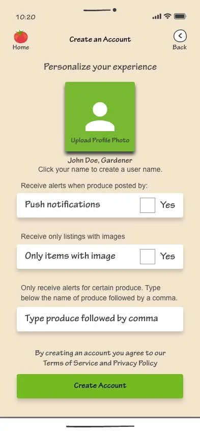
Individual Login
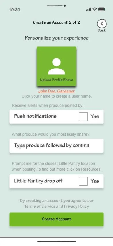
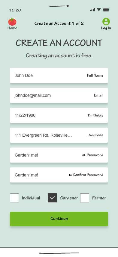
Gardener and Farmer Login
User Feedback
Feedback was essential and included in final designs. Specifically I created the ability to simply use the app with no log in, but if you wanted you could create a log in and personalize the experience.
Through the feedback I found an excellent resource for produce information. This is an external link to another website.
The Result
Created a digital tool that
fosters community, reduces food waste, and empowers others to make a difference.
Greatest Obstacle
Grabbing the attention of
overworked, passionate leaders and harnessing their
information and attaining
buy-in.
Next Steps
Develop an Effective Shares program for Grocery Stores harnessing AI and Processes Learned on this Project.

Favorite Part
Creating a garden vibe for the design that was clear and simple. Talking to all of the food advocate leaders.
Conceptual Technical
Do social good. Narrow
scope to food waste and food insecurity. Narrow scope to a doable, attainable goal.

Hi! I am Meg.
My work is fueled by the passion to identify, cultivate, and unleash the untapped potential of individuals, empowering diverse leaders to make a positive impact on our world.
I achieve this by creating human-centered designs that foster meaningful connections, eliminate barriers, and pave the way for mutually beneficial outcomes.
In UX/UI Design, I am interested in areas related to Accessibility, Sustainability, and Generational Design.
If not creating, I am busy adventuring in the great outdoors with my family!